Designing a thriving help center

Omni-channel help center experience for GlassesUsa.com
Project Overview
Mobile is fast becoming the most popular platform when it comes to browsing the web. Over 58% of our users choose mobile devices as their preferred platform to browse. The absence of a mobile version to our help center added to the many reasons of which we decided to launch a brand new omnichannel help center experience.
Introduction
GlassesUsa.com Help Center is a knowledge library that provides help guides, articles, and videos for end-users looking to purchase themselves or for their loved ones eyewear products. Reaching out to users when most frustrated with well-organized and helpful information can reduce stress and change completely their feeling about the entire purchasing process. Whether it's prescription-related information or knowledge about how to buy glasses online, the new help center allows users to find the information they need within just a few clicks.
Discovery
Emphasize | Define

The problem

As a result of outdated design, inconsistent content, limited search functionality, limited interactivity, inadequate mobile support, and poor accessibility - users who require support in their journey - experience confusion and frustration, which leads to a high number of customer service calls (chat, emails, phone calls) and low conversion rates.

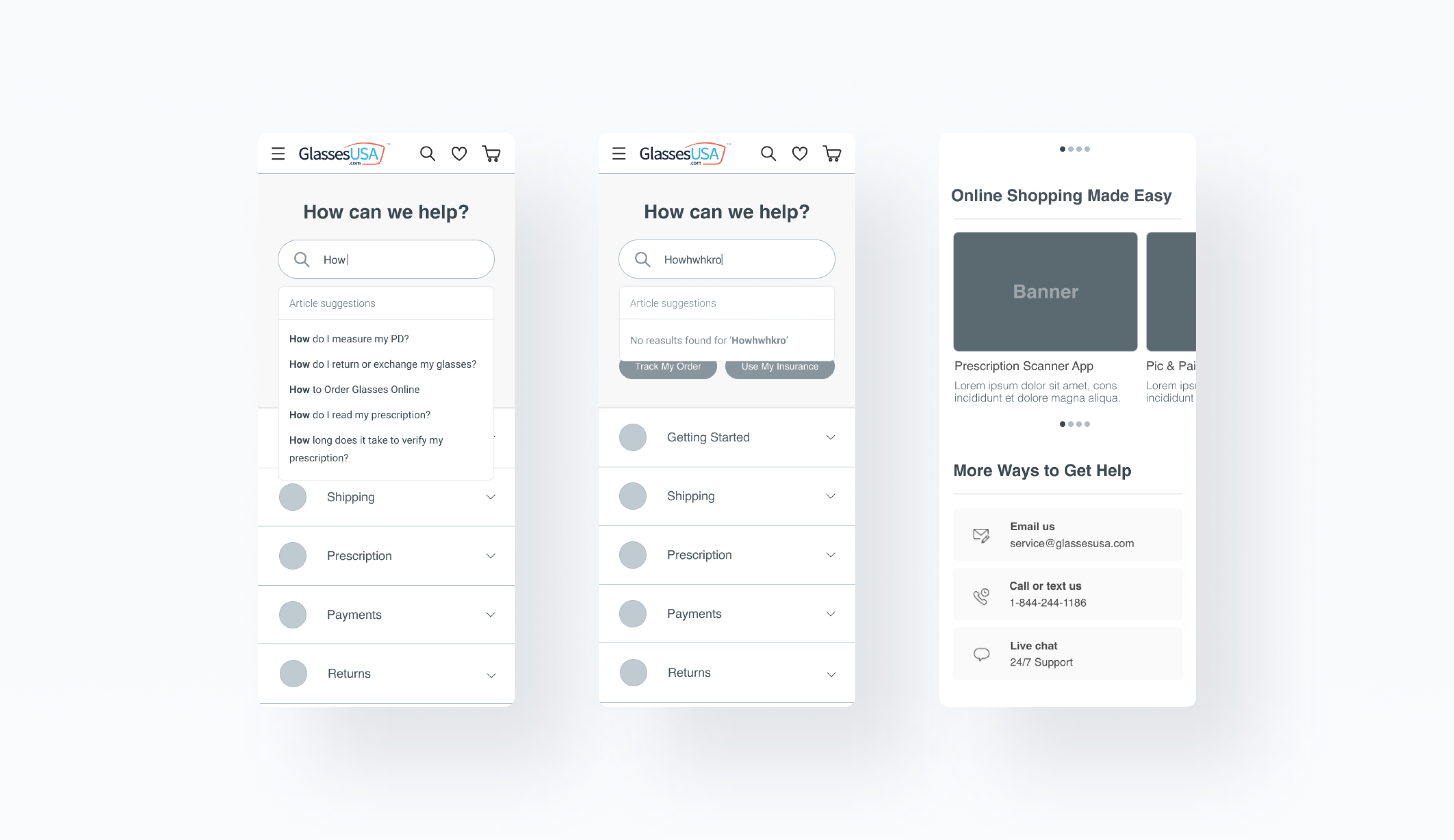
  • Usability gaps - Poor information architecture, outdated layouts, and limited search functionality do not meet current UX standards. Observations (with FullStory) showed that users struggle to navigate and find information they need, leading to frustration and potential abandonment.
  • Inconsistent content - Over time, the content of the help center became outdated, incomplete, and inconsistent. This led to confusion and frustration among users who encounter conflicting information or not fully covered topics.

Goals

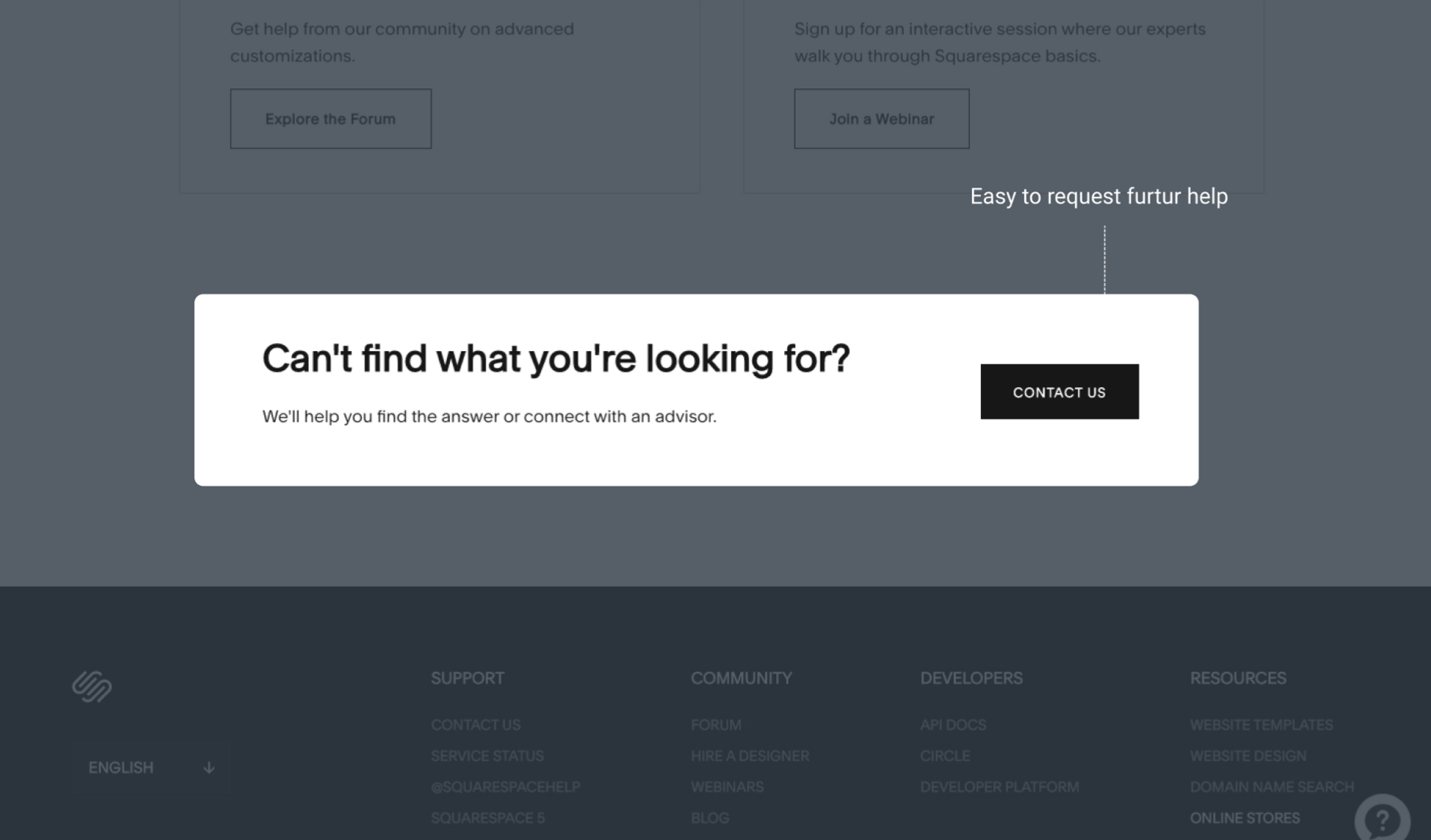
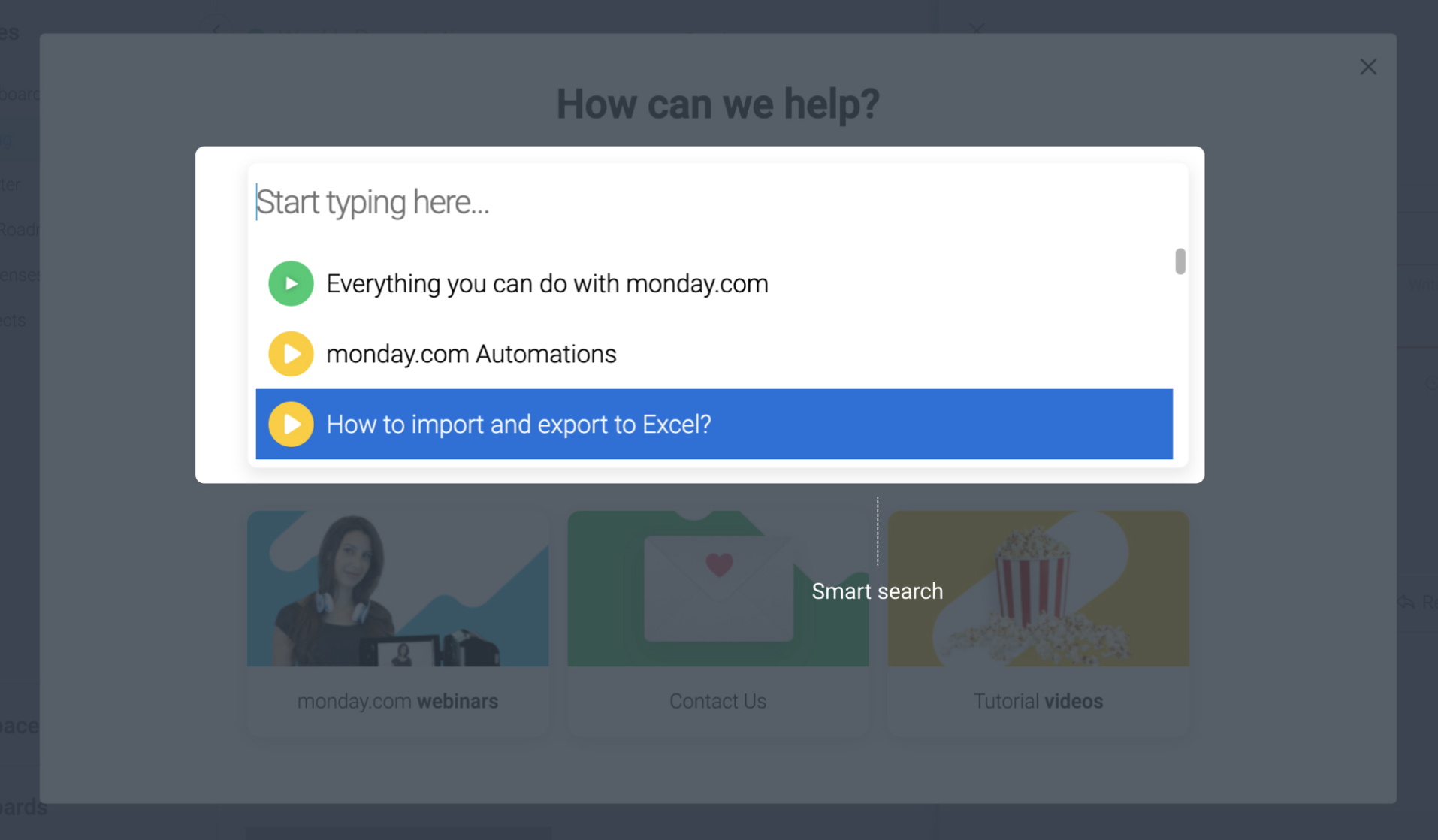
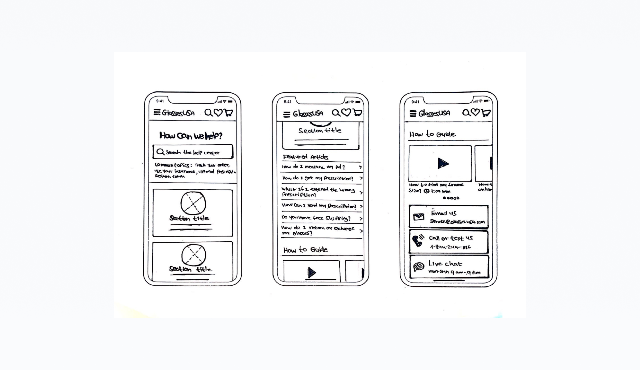
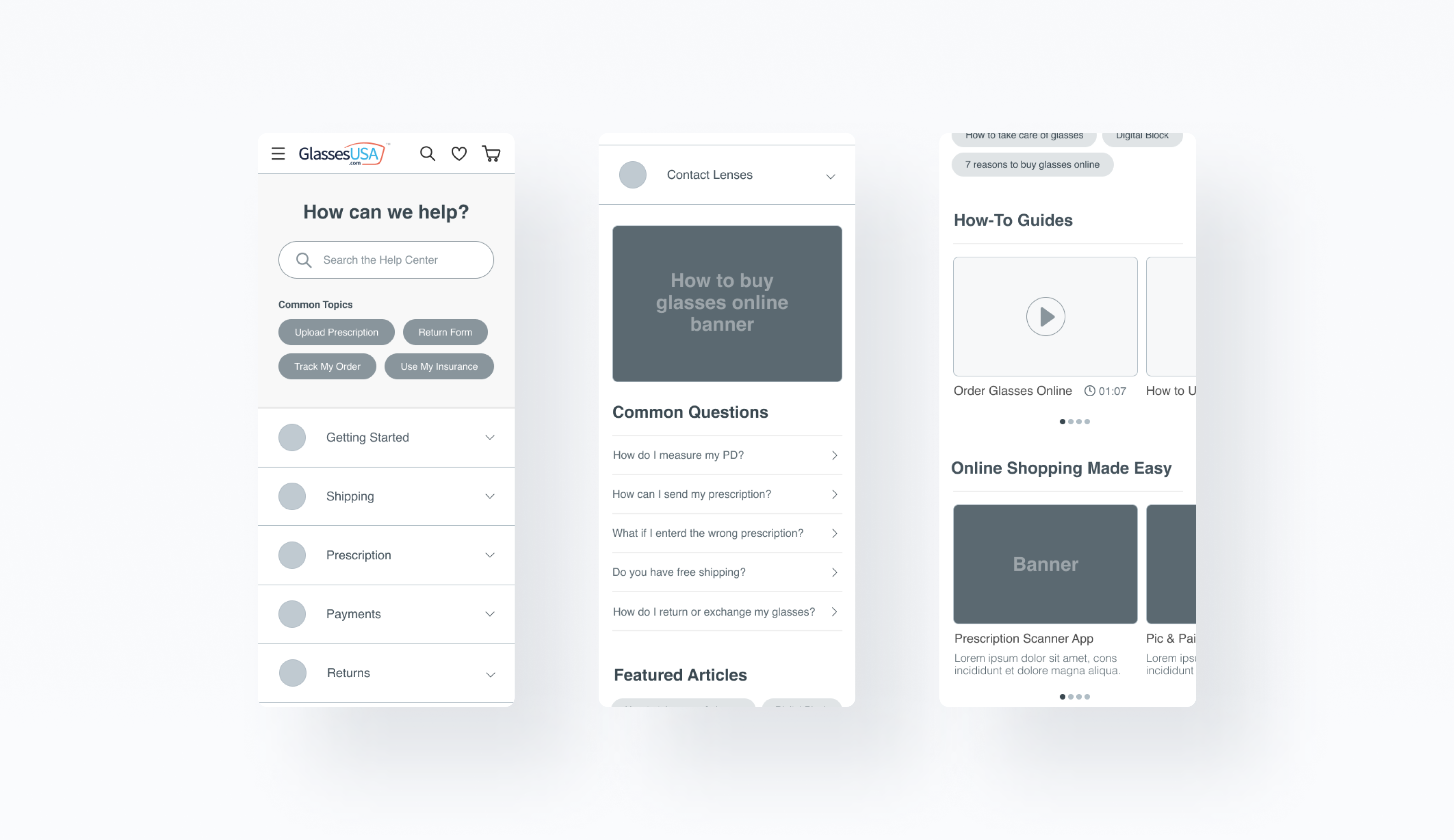
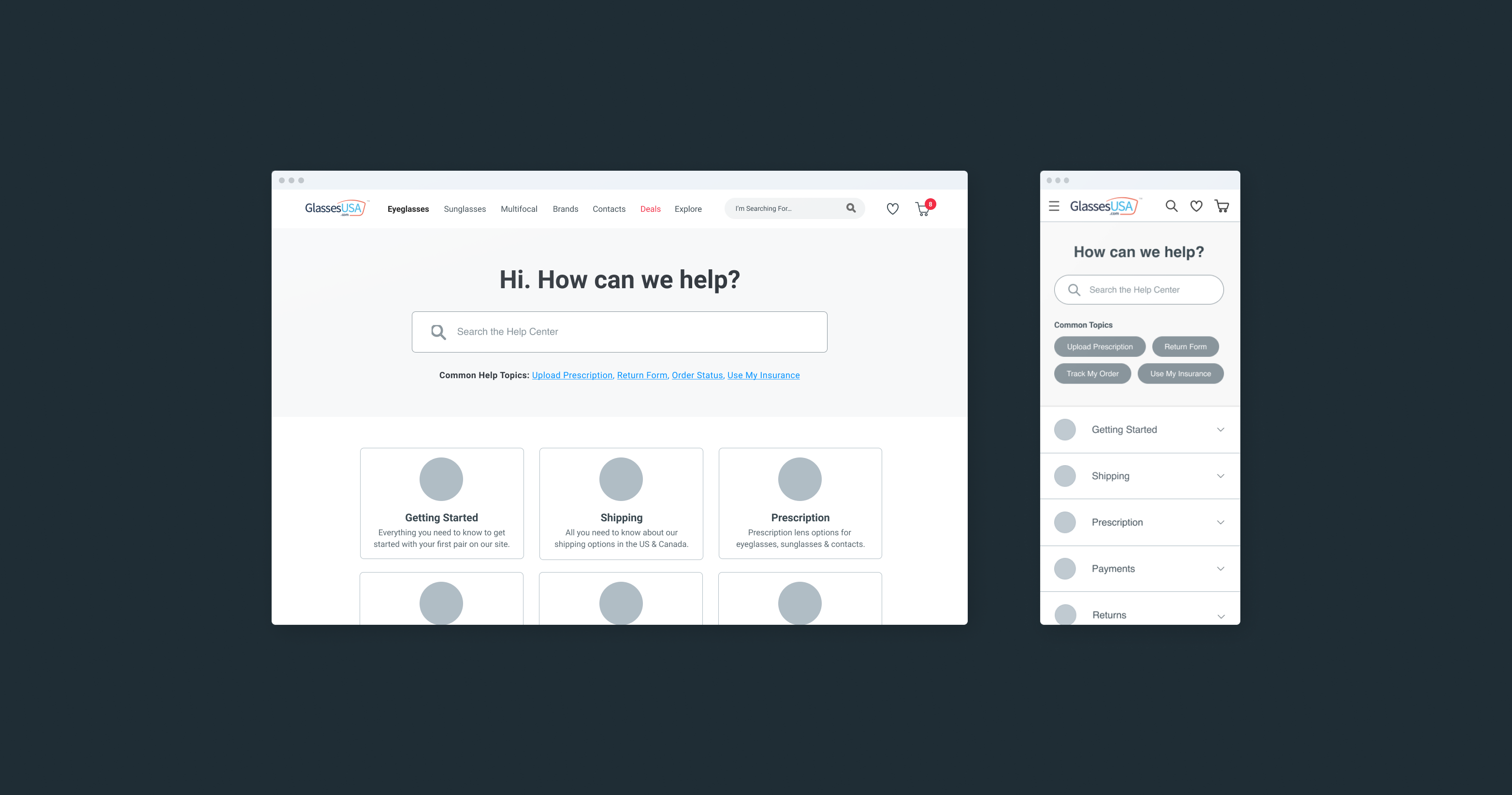
  • A user-friendly and efficient support system that helps users to easily find answers to their questions or solve their problems.
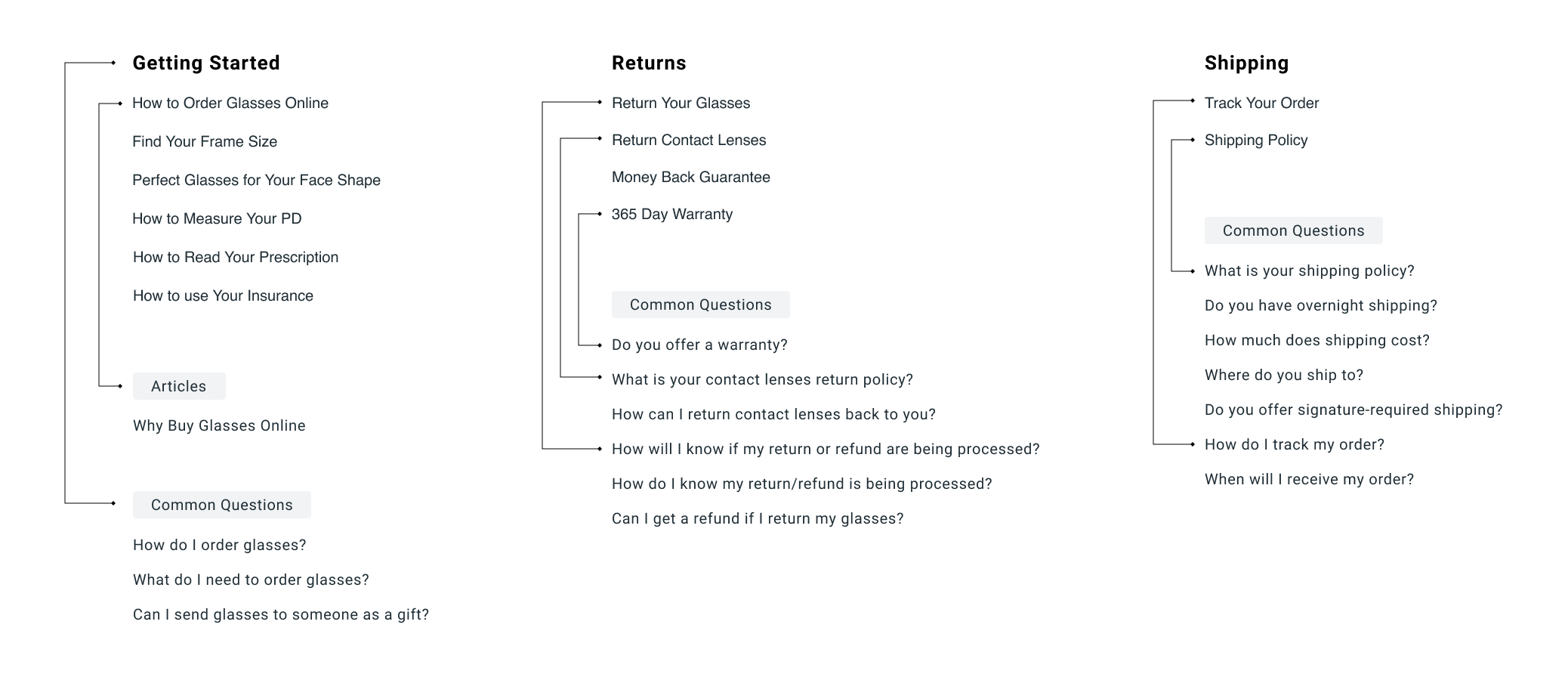
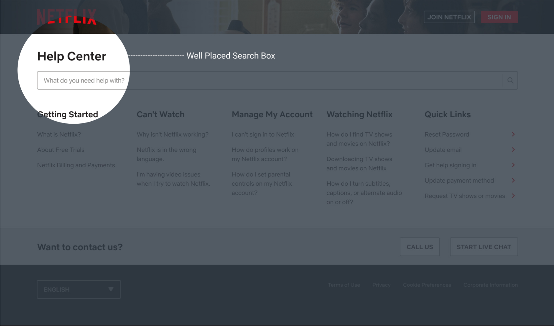
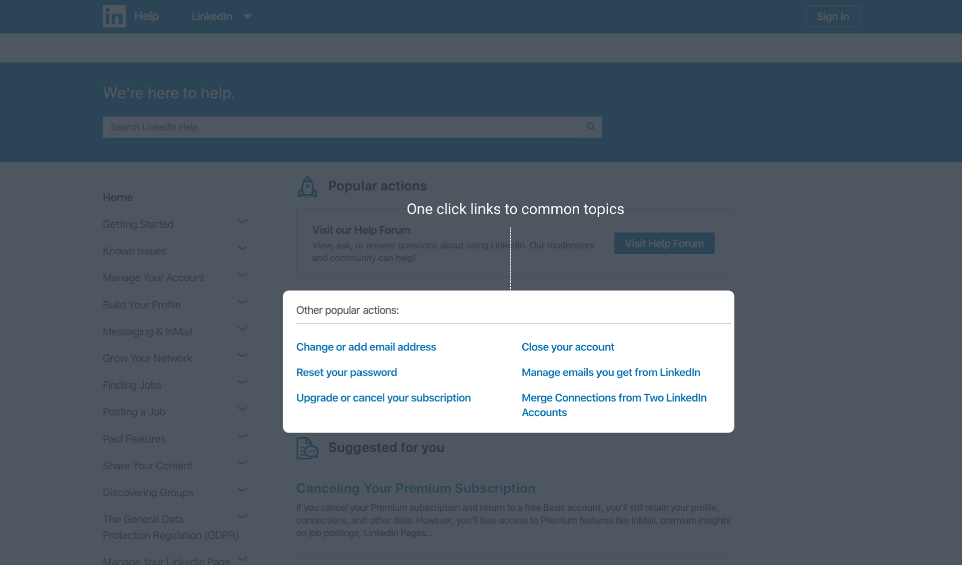
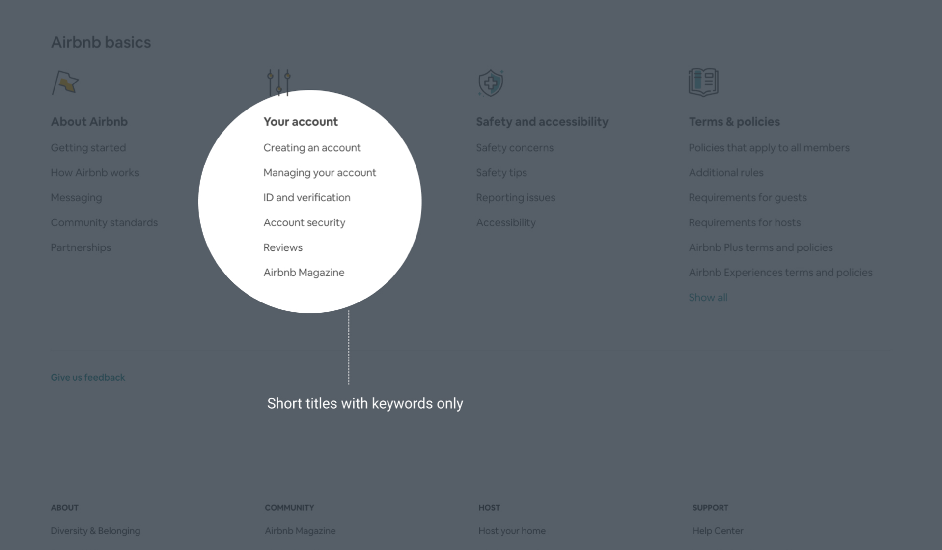
  • Organized navigation system - Help centers often contain a lot of information, which can be overwhelming for users. Designing an intuitive information architecture and navigation system is crucial to ensure that users can find the information they need quickly and easily.
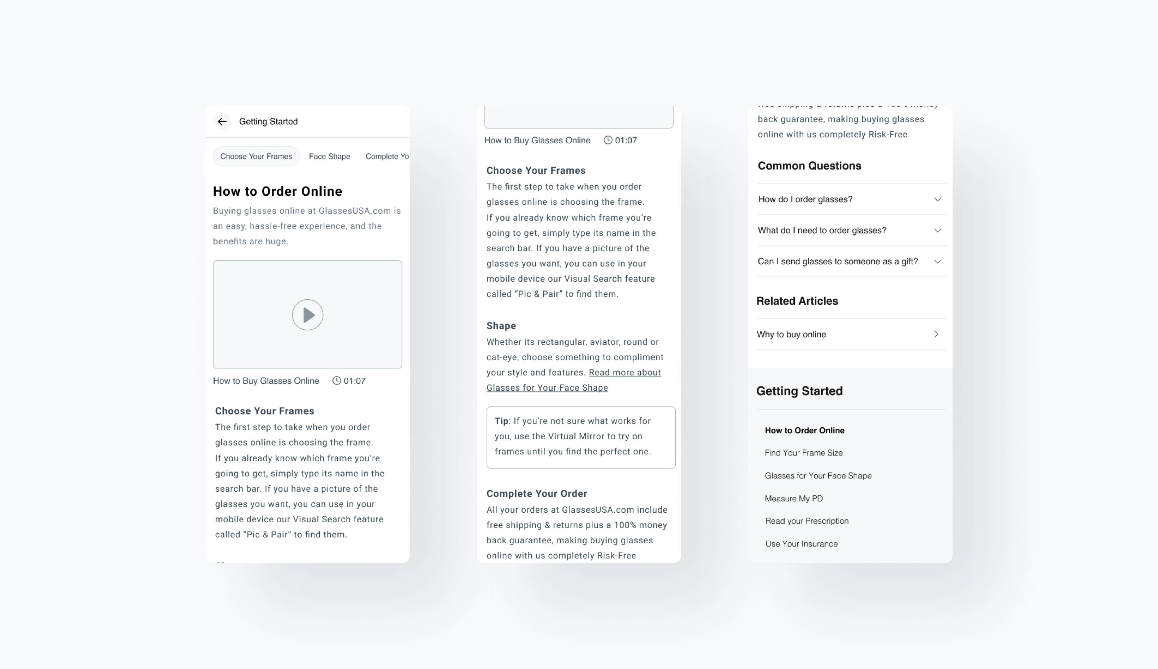
  • Accurate, up-to-date, and easy-to-understand content - This requires working closely with subject matter experts and technical writers to ensure that the content is clear, concise, well-organized, with language that is easy for users to understand, and focus on user needs.
Research
Market and Competitors
To design a useful help center, it's important to understand the needs and goals of the users who will be using it. This requires conducting user research, gathering feedback, and analyzing user data to ensure that the help center is designed to address the most common and important issues. As part of the discovery phase, I observe sessions using FullStory, interview stakeholders (CS representatives, marketing teams, SEO experts), research the market and competitors, gather quantitative data (analytical data, click rates, rage clicks, hover interactions), and analyzed heat maps and scroll maps. Prior to the ideation process, I scanned over 50 help centers, both mobile and desktop, to identify key conventions to create a valuable and user-friendly framework. As a result, I learned six key features that significantly improve the overall experience of providing assistance when applied well.

#1 Well placed search box

It is extremely important to provide easy navigation to the things that matter most.
For example, search is an important feature that your customers will be looking for.
Make sure it’s easy to find and use.

Netflix Help Center

#2 One-click links to common topics

I used our data to research and understand what are the most common topics our users need help with. Data showed that over 40% of users needed help the most with uploading their prescription post-purchase, following that was the Returns form, Order tracking, and How to use insurance article. Highlight these topics can save a lot of time and effort for most users.

Linkedin Help Center

#3 Titles: Short with key words   |   #4  Clear categories and sub-topics.

Users are scanning your information to identify the relevant topic they need help with. Keep your titles short as much as you can and use main keywords.

Airbnb Help Center

#5 Easy to request further help.

Some of the users are passive help seekers, they usually won't use the search box or browse for an article to get help, their preferred way of getting assistance is via a human representative; chat, call, or email. Another common use case (we try to avoid with the new IA) is when the user just can't find the information (s)he needs. When most companies prefer to minimize attention to such components in a way to reduce customer support efforts, we chose to highlight them, to ensure trust and confidence. More ways to get help could be an important fallback to those scenarios.

SQUARESPACE Help Center

#6 Smart search: Auto complete.

When your users select from search suggestions rather than typing in their own complete query, they benefit because they: Pick an appropriate term, which will show them good results, rather than making up a query that might have no results or poor results. Decrease interaction cost, because they can type less. Avoid typos, because they don’t need to type out the entire query themselves. Use less mental effort to search, because they can simply recognize the right words or phrasing they want.

monday.com Help Center

Mobile first

Mobile is fast becoming the most popular platform when it comes to browsing the web. Over 58% of our users choose mobile devices as their preferred platform to browse. The absence of a mobile version to our help center added to the many reasons of which we decided to launch a brand new omni-channel help center experience.

I chose to use a mobile-first design approach to ensure a seamless cross-device experience.
As our customers continue to shift their preferences to mobile more and more, its importance becomes more apparent.

Planning & Ideation

  1. Well placed search box.
  2. Smart search: Auto complete.
  3. One-click links to common topics
  4. Titles: Short with key words.
  5. Clear categories and sub-topics.
  6. Easy to request further help.
The new Help Center's user flow

More Projects