How can we facilitate product exploration and discovery experience?
New navigation layout to reduce choice paralysis
Project Overview
GlassesUSA.com is The fastest-growing, leading online eyewear retailer in the United States. With over 12,000+ frames and styles to choose from, finding your perfect pair can turn out to be not an easy task to handle. Observing the data over time, we can see that the greater the selection, the fewer hits to the product pages (CTR).
Introduction
A well-designed navbar allows users to easily navigate the website and find the products they are looking for. This is especially important for websites with a large number of product choices, as a cluttered or confusing navbar can make it difficult for users to find what they are looking for and may lead to them leaving the website. A well-organized navbar can help users quickly find the products they are interested in, leading to a better user experience and potentially increased sales for the website.
Challenge & Goals
Problem statement
Choice paralysis, also known as analysis paralysis or indecision, is a phenomenon that occurs when individuals are presented with too many options and become overwhelmed by the task of choosing. There are several factors that can contribute to choice paralysis on an eCommerce website. One of the main causes is the presence of too many options. When users are presented with an overwhelming number of product choices, they may become overwhelmed and unsure of how to make a decision. Another factor that can contribute to choice paralysis is a lack of clear organization or categorization of products. If products are not organized in a way that is easy for users to understand and navigate, it can be difficult for them to find what they are looking for, leading to frustration and potentially causing them to leave the website.
Problem Definition
The overwhelming amount of choices makes it difficult for users to make a decision Resulting in a frustrating experience and low conversion rates.
Goals
- Reduce Choice paralysis - Helps users understand where they landed - Enhance users’ understanding of how to use the product - Communicate the products' topics and information in an accessible manner
The Design process
Hypothesis & Research
Hick's law states that the more options are available to a person, the longer it will take for him or her to make a decision about which option is best. In light of observations, knowledge of psychological principles, and data collected previously, we reached the following hypothesis;
By creating small thematic categories, users will be exposed to fewer [but more accurate] options, reduce choice paralysis, and increase conversions.
Literature review
Nielsen Norman Group - eCommerce User Experience Vol.2, Chapter 5 - Navigation and Classification. +10 more articles [for specific topics]. Deliverables - a summary report was provided as preparation for the UX phase, including relevant usability topics and short explanations of how to apply them effectively.
Best practice review
Baymard Institute - Navigation Guidelines [Premium content] 308 ‘Top-Level Navigation’ Design Examples 697 ‘Drop-Down Menu’ Design Example Deliverables - A List of practical and detailed guidelines to take under consideration in the UX phase.
Market & Competitors
15+ Retail industry giants 11 Direct & Indirect competitors Deliverables - market & competitors review in the form of a presentation, divided into sections based on the guidelines and topics gathered in previous steps.
Deliverables
Insights
1. Make Product Categories the First Level of the Main Navigation 2. Site-Wide Courtesy Navigation 3. Category-Subcategory Relationships 4. Thematic Resources and Guides in the Main Navigation 5. Main Category Options Should be Selectable and Point to a Page Featuring Sub-Categories 6. Provide Information Scent for Navigation Options in Jargon-Driven Domains 7. Highlight Current Scope in the Main Navigation 8. Drop-Down Menus Should Have Spatial Indicators 9. Show the user’s current location in the site
Starting point - Current experience
Analyzing Data
Developing a data-driven information architecture
Building concept
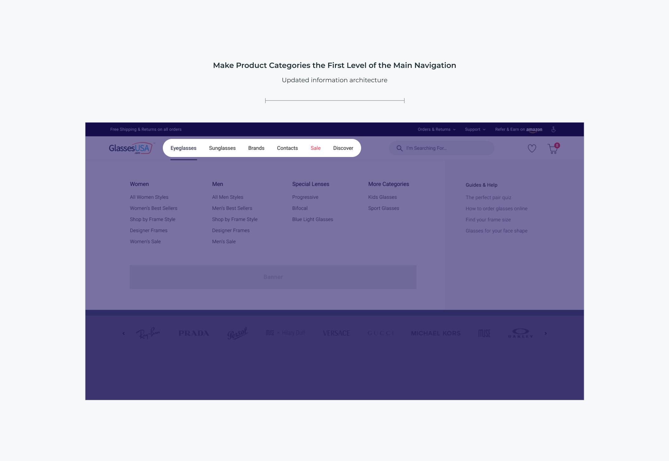
Make Product Categories the First Level of the Main Navigation
Use global navigation to show users which product categories are available on the site. The Multifocal and Blue light categories were removed from the global navigation since they represent lens types rather than product categories.
Thematic Resources and Guides in the Main Navigation
Sometimes users need to adopt a thematic product-browsing strategy to learn more about a product domain or be inspired but don’t know if the site has such content available. Learning resources — or thematic, inspirational, or guided navigation paths — a site has, will be paramount to those users who are navigating an unknown domain, or who may be seeking inspiration or alternative paths to the products they’re looking for.
Category-Subcategory Relationships
Choice paralysis proved to be one of the biggest issues related to drop-down menus during testing. At the core of this issue is a lack of curation (grouping) of the available options.
Site-Wide Courtesy Navigation
While browsing for products is the main task for users at an e-commerce site, being able to easily navigate to secondary non-product content is still important
Usability Testing
Where would you find our 'Order tracking' page? Were there any other options you considered selecting instead? Where would you find our 'Multifocal \ Progressive' page? Where would you find our 'Make a return' page? What would you do if you are looking to get some help? What would you do if you wanted to start a live chat based on what you see? Explain why.
“Everything seems very on point, very intuitive, I think all of the links that I mention were the correct places to find them”